연습문제를 Python을 이용하여 그래프를 그려보도록 한다. Exercise 21에 수록된 내용이다.
아래의 table은 the National Health Interview Survey에 보고된 수입에 따른 위궤양 발생 비율을 보여주는 것이다.
| Income | Ulcer rate(100명당) |
| $4,000 | 14.1 |
| $6,000 | 13.0 |
| $8,000 | 13.4 |
| $12,000 | 12.5 |
| $16,000 | 12.0 |
| $20,000 | 12.4 |
| $30,000 | 10.5 |
| $45,000 | 9.4 |
| $60,000 | 8.2 |
위의 테이블을 list form으로 나타내면 다음과 같다.
 income =  [ [4000,  14.1],
 [6000,  13.0],
 [8000,  13.4],
 [12000, 12.5],
 [16000, 12.0],
 [20000, 12.4],
 [30000, 10.5],
 [45000, 9.4],
 [60000, 8.3]
 ];
위는 이차원 배열이기때문에 plot을 하기 위해서는 x axis, y axis를 위한 data를 분리해야한다.
 [row[0] for row in income]; # [6000, 8000, 12000, 16000, 30000, 45000, 60000]
 [row[1] for row in income]; # [14.1, 13.0, 13.4, 12.5, 12.0, 12.4, 10.5, 9.4, 8.3]
분리된 data를 다음 구문처럼 plot을 한다.

다음을 출력하는 source code는 다음과 같다.
import matplotlib.pyplot as plt
 income = [
 [4000,  14.1],
 [6000,  13.0],
 [8000,  13.4],
 [12000, 12.5],
 [16000, 12.0],
 [20000, 12.4],
 [30000, 10.5],
 [45000, 9.4],
 [60000, 8.3]
 ];
 plt.plot ([row[0] for row in income],[row[1] for row in income], 'bo');
 plt.xlabel ('Income');
 plt.ylabel ('Ulcer rate');
 plt.show();
아래와 같은 구문을 넣어주면 훌륭하게 linear estimation이 된다. 단순히 시작점/끝점을 정의해주면 알아서 line을 그어준다.
plt.plot ([4000, 60000], [14.1, 8.3]);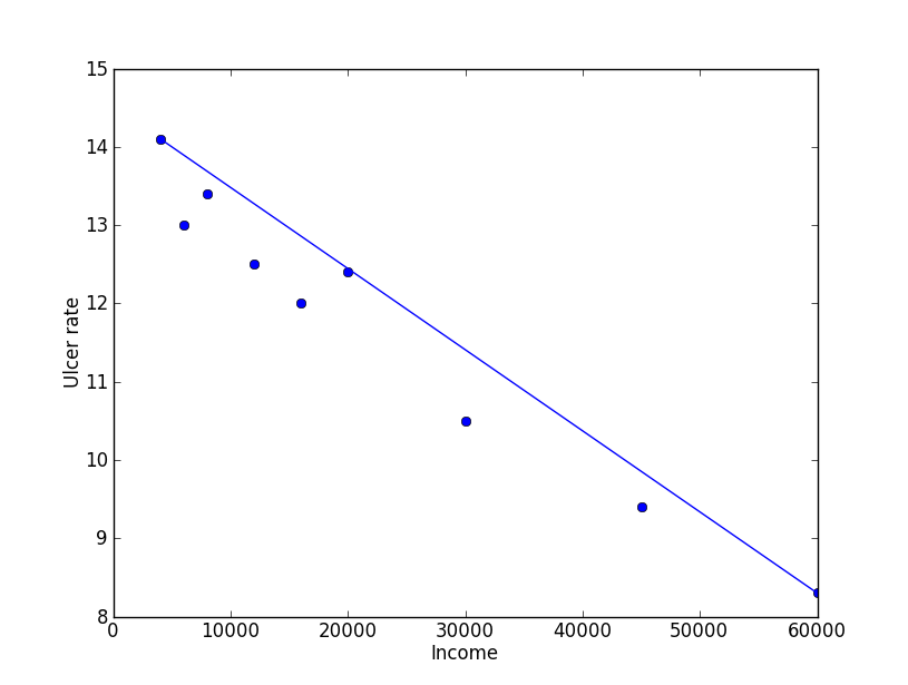
least squares regression은 아래의 방정식을 통하여 y=mx+b의 계수를 구할 수 있다.
\(\displaystyle m\sum_{i=1}^{n}x_{i}+bn=\sum _{i=1}^{n}y_{i}\)
\(\displaystyle m\sum_{i=1}^{n}x_{i}^2+b\sum_{i=1}^{n}x_{i}=\sum _{i=1}^{n}x_{i}y_{i}\)
우선 위에서 plot을 하기 위해서 한 것 처럼 table에서 income과 rate를 분리한다.
income =[]; rate = [];
 income =[row[0] for row in table];
 rate = [row[1] for row in table];
\(\displaystyle m\sum_{i=1}^{n}x_{i}\;\;\;\cdots (1)\)와 \(\displaystyle \sum_{i=1}^{n}y_{i}\;\;\;\cdots (2)\) 는 아래와 같이 간단히 표현이 된다.
(1) = sum(income);
(2) = sum(rate);
두번째 식에서의 항을 코드로 표현하면 다음과 같다.
\(\displaystyle m\sum_{i=1}^{n}x_{i}^2\;\;\;\cdots (3)\)와 \(\displaystyle \sum_{i=1}^{n}x_{i}y_{i}\;\;\;\cdots (4)\)
(3) = sum([x**2 for x in income]);
(4) = sum([income[i]*rate[i] for i in range(len(income))]);
이렇게 풀어낸 다항식의 항은 아래와 같이 matrix의 형태로 나타낼 수 있으며 이를 통하여 해를 구할 수 있다.
\(\begin{bmatrix}a & b\\ c & d\end{bmatrix} \begin{bmatrix}m\\b \end{bmatrix} = \begin{bmatrix}x\\y \end{bmatrix}\)
python에서 matrix의 형태를 나타내기 위해서 numpy를 필요로한다. 또한 같이 제공되는 linear algebra를 사용하면 쉽게 해를 구할 수 있다.
 from numpy import *
 from numpy.linalg import *

 a = sum (income);
 b = len (income);
 c = sum([x**2 for x in income]);
 d = sum (income);

 x = sum (rate);
 y = sum([income[i]*rate[i] for i in range(len(income))]);

 coef = array ([[a, b], [c, d]]) # coef에 2x2 matrix를 설정
 xy = array([[x],[y]])
 mb = solve (coef, xy) # matrix 형태의 해를 구한다.
이렇게 구한 기울기의 값을 다음 code 로 plot을 한다.
plt.plot ([0 ,income[-1]], [ mb[0]*0 +mb[1] , mb[0]income*[-1]+mb[1] ],'r') # mb[0] : m, mb[1] : b아래의 붉은색 선이 least square regression을 통하여 구한 graph이다.

least square regression을 통하여 얻어진 기울기가 m, y축 절편이 b가 되는 1차 다항식이고 m,b는 이미 구하였기 때문에 income에 따른 ulcer rate를 쉽게 구할 수 있다.
print mb[0]*25000+mb[1]; # result is 11.47%table에 있는 ulcer rate는 100 population 기준이므로 rate에 100을 곱하면 된다. 하지만 이미 %로 환산된 것이므로 반올림을 rate에서 소수점을 뺀 값이 된다.
print (mb[0]*80000+mb[1]); # result is 6income에 200,000일경우 값은 -5.77이 출력된다. 하지만 실제적으로 음수가 발생되는 것은 아니므로 소득이 많으면 위궤양이 발생하지 않는다는 의미가 된다. 그래프에서 rate가 0이 되는 income은 $140,000이므로 이 이상의 소득을 얻는 집단은 위궤양 환자의 비율이 0에 가깝다라고 볼 수 있겠다. 부자는 잘먹고 잘살아서 병에 걸릴 일도 없나보다. 뭥미?